
How we use the hill chart to conquer deadlines
What is the hill chart?
The hill chart, as the name implies, is a chart shaped like a hill that is used by software development teams to track and communicate their work progress.
Circles are placed at various positions on the hill chart to indicate how far along they are in their progress.
Each circle represents a piece of work. In the Shape Up world each circle is a scope. On Basecamp to-do list. And on Jira it’s a story.
The hill chart was invented by Ryan Singer, originally for internal use among Basecamp’s employees.
It became known worldwide when Ryan published the Shape Up book and included the hill chart in the book.
Benefits of the hill chart
It’s fascinating that the hill chart has become arguably one of the most iconic things that emerge from the Shape Up book.
This is despite the fact that the book is filled with interesting concepts, such as breadboarding, fat marker sketches, cool down, scope hammering, etc.
People gravitate toward the hill chart naturally, thanks to its simplicity and visual nature.
But this isn’t why the hill chart matters.
The hill chart is a brilliant tool for sequencing and timing work correctly: what you should prioritize early, and what can wait.
It also instills a lean and incremental mindset.
If you use the hill chart properly, missing deadlines will become a thing of the past.
Additionally, the hill chart helps you remove a specific type of communication friction: the feeling of being micromanaged.
Most stakeholders ask for status updates for non-malicious reasons.
Perhaps they’re synchronizing timing with another department. Or they’re figuring out dependencies.
Unfortunately, asking for a status update is an all round stressful affair for everyone involved, even if the intention is good.
The person asking has to walk on eggshells for fear of being misunderstood as micromanaging you, while you feel defensive every time someone asks about your progress.
This is the nature of “pull” communication, where the stakeholder “pulls” progress information from you. It’s full of friction.
By flipping status reports to a “push” model, where builders self-report their status, the hill chart eliminates the feeling that one person is breathing down the neck of another.
This may seem like a minor benefit, but it’s not. Good communication and collaboration are key to high performance.
Better visibility (of incorrect prioritization) is another benefit of the hill chart.
If people start pushing circles downhill while leaving critical circles languishing in the uphill phase, you will spot that immediately.
This aspect of the hill chart is really powerful. I can’t stress this enough.
This is how you conquer deadlines.
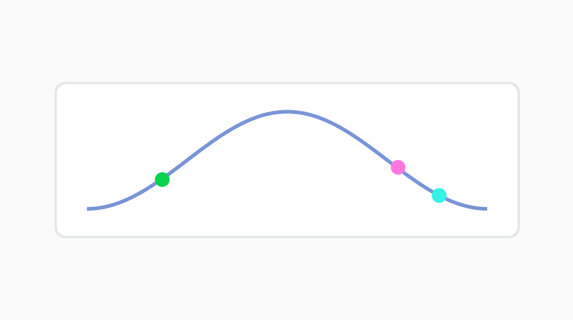
If the green circle is a critical piece of work, and your hill chart looks like this, you’ve got a problem. Issues like this become visible thanks to the hill chart.
Finally, the hill chart enables you to notice team members who struggle silently.
Some people have a hard time asking for help.
If you use the hill chart, their struggle will manifest in the form of a stationary circle.
A circle that hasn’t moved for several days becomes visible to everyone in the team, allowing you to identify and remedy stuck work (obviously the intention is not to place blame on individuals).
How should you use the hill chart?
The uphill metaphor serves as a reminder that you should start with the riskiest, the hardest, or the least understood chunk of work first.
This much everyone agrees.
However, there is no single rule for how to further divide the uphill and downhill phases.
Different people do it differently.
We’re among those who diverge from the Shape Up book canon.
I like our unique way of using the hill chart, and I want to share it with you.
But before that I will explain the official way of using the hill chart as described by the Shape Up book.
1. The official way
The book is pretty clear about how you should break down the uphill phase.
You can think of uphill as having three sub-phases:
You’ve thought about this
You’ve validated the approach, not just in your head, but by spiking the solution
You’re far enough with your work that you don’t believe there are unknowns
A scope (or story) can only be moved to the top of the hill once it has satisfied all three sub-phases.
The book further recommends that you don’t fully complete your first scope all the way.
Instead, you park it at the top of the hill, and pick up the next riskiest scope, which you will then push to the top of the hill chart, and so on.
2. Our way
We begin a project by working on the toughest stuff first.
We want the experience of starting a project to be akin to pushing a boulder uphill.
If work feels easy at the start of a cycle, we know that we have sequenced our work wrong, and that our deadline would be at risk.
Essentially, we use the uphill metaphor as a reminder to work hard early for future payoff.
We tweak the uphill phase and make it stricter than the official version mentioned in the Shape Up book.
Our version leaves less room for surprises.
We only move a scope to the top of the hill when it has been integrated end-to-end in its entirety.
As in, the feature is essentially usable, albeit with a lot of extremely rough elements.
The difference may be too subtle for some, so I’ll spell it out explicitly:
In the official version, you move a scope to the top when you believe there are no more unknowns.
In our version, we do so when the code for the whole flow has been written. We take it one step further.
Our aim for the uphill phase is to touch all layers that need to be touched.

In the “eliminating unknowns” sub-phase we do things like spiking unfamiliar third-party APIs.
In our version of hill chart usage, a scope that has reached the top only has improvement and polish work left.
Improve the code. Polish the tests. Polish the UX. Improve performance.
You might be wondering if requiring so much to reach the top of the hill makes it pointless.
It doesn’t.
A scope at the top still has plenty of work left in it.
Yes, it has been fully wired, but many things about it are still nasty.
Copy-and-paste code. Log statements everywhere. Horrible UI.
This is how I think about uphill vs downhill: uphill is for eliminating surprises, while downhill is for eliminating nastiness.
Like the official Shape Up approach, we don’t take a scope all the way to the end as long as there’s one that hasn’t reached the top.
Around week four (or even five sometimes), we start having scopes clustering around the top of the hill.
Only after all scopes have reached the top do we start pushing them to the end one by one.

If we can get all scope to the top by week five, shipping on time is virtually guaranteed
This part - pushing circles down the hill - is a lot of fun.
Cleaning up the code and polishing the UI in particular feel very satisfying.
Who doesn’t enjoy cleaning up crappy code?
Or bringing dull UI to life?
The Shape Up Board app
Shape Up Board borrows Basecamp’s open ended labels.
“Figuring things out” for uphill, and “making it happen” for downhill.
Shape Up Board is unopinionated about how you want to structure your uphill and downhill phases.
It doesn’t label any specific sub-phases. (It used to but we removed them thanks to user feedback.)
Conclusion
The hill chart is a lot more powerful than its simple appearance suggests.
By making progress status visible, it enables you to pause and pick up work strategically.
Using the hill chart makes shipping on time become much easier. And a lot of fun too.
You must try it, whether or not you embrace the whole Shape Up philosophy.